Grid is a basic building block made up of horizontal or vertical or curved guidelines to create beautiful designs. Grid makes consistency over a work, Grid helps systematic arrangements of graphical elements in.
Grid systems are a vital part of web designing these days. When it comes to web page designing they are a system of rows and columns to control the page layout using a set of CSS classes. We can say they are more like scaffolding, an aid to deploy content throughout the page.
Of course there are pros and cons for everything, let’s discuss the positive side here for now. Fist advantage of using a grid system is development speed. you can craft a simple layout in seconds using grid systems. Even the most experienced developer could have issues when floating layout blocks. Grid systems make it easier to build complicated nested layout.
Another advantage is Stability and Consistency when building complex solutions. when using grids every element will get an order, it is good for usability.
Today we have put together an amazing collection of grid resources for web designers. This includes many stand-alone grid systems, Front end frameworks, Grid calculators and tools.
See also : Bootstrap Grid System PSD Templates
BEST GRID SYSTEMS CATEGORIES
An amazing collection of grid resources for web designers. This includes many stand-alone grid systems, Front end frameworks, Grid calculators and tools.
Responsive Grid Systems
Table Grid

This is a serious-fun-dumb-useful experiment for writing a simple, responsive, and mobile-first CSS grid system. With tables.
Gridtacular

Gridtacular is a modular flexbox powered responsive grid system. The grid has been designed from the ground up to adapt to your workflow and naming conventions.
GUI Grid

It’s very important to pay attention to the layout and spacing of every element in the UI. The classes in this module provide a responsive grid for column layout, methods to manipulate the visibility of elements and classes to space elements quickly and accurately using the design system.
Grid
A simple & semantic responsive grid system.
Gridlex
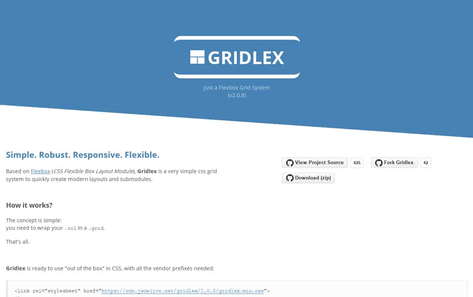
Gridlex is a very simple css grid system to quickly create modern layouts and submodules.
Gridly
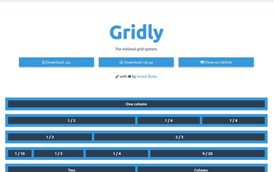
The minimal grid system for modern browsers.
BbGrid
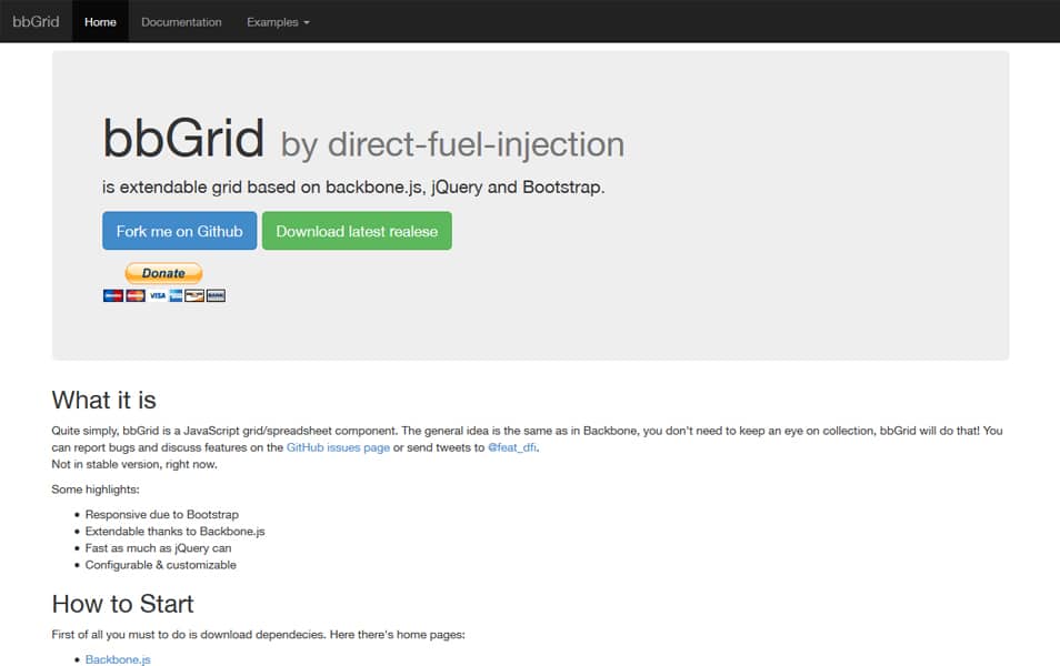
That’s an extendable grid system (jqGrid like) developed on Backbone.js, Bootstrap and jQuery frameworks.
GridOS
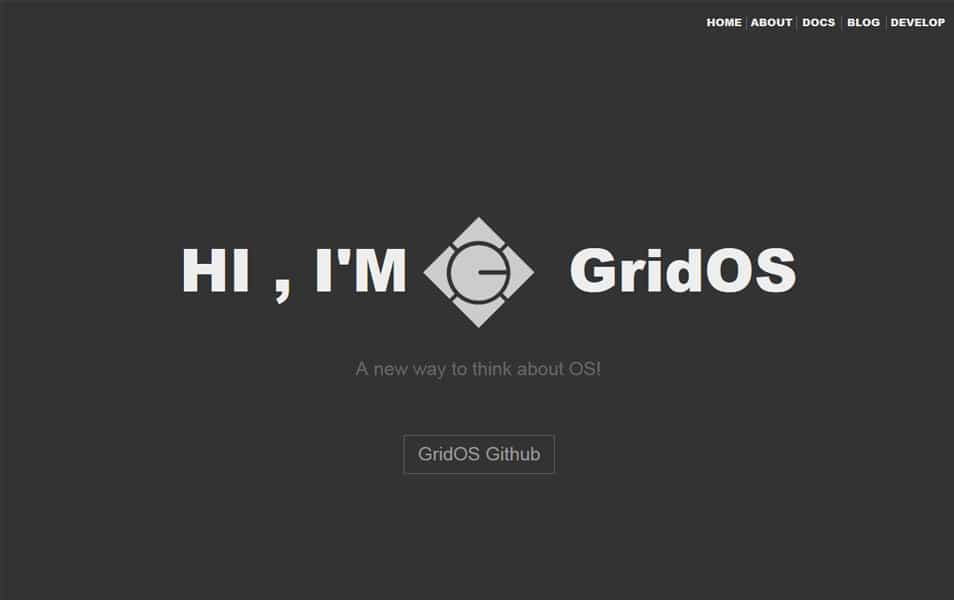
Grid Operating system.
Gridlock
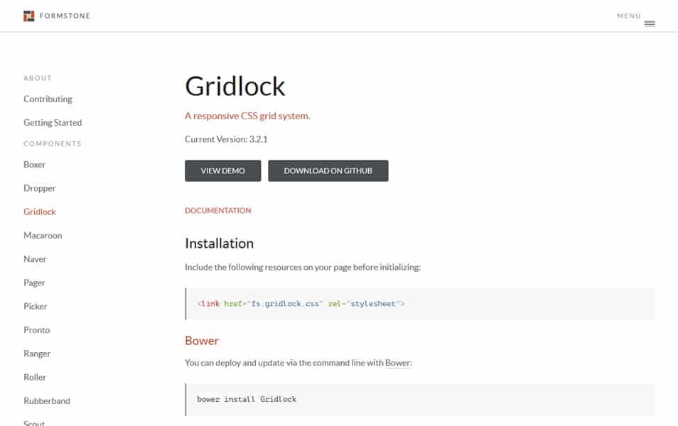
A responsive CSS grid system.
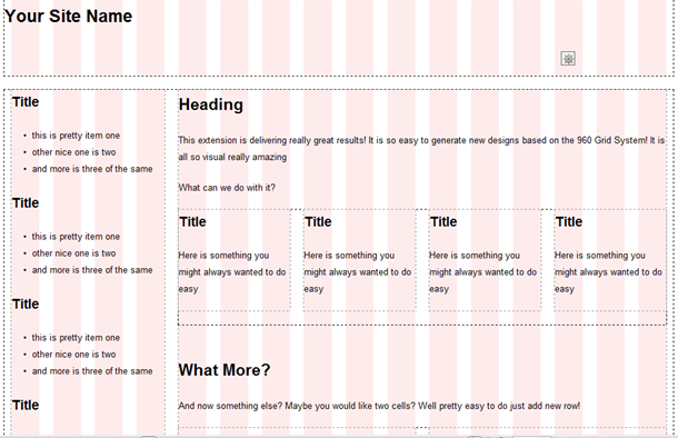
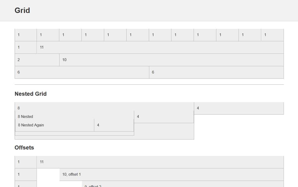
960 Grid System
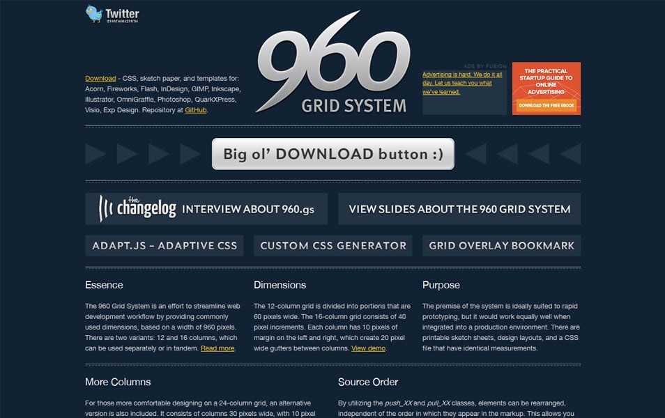
The 960 Grid System is an effort to streamline web development workflow.
Unsemantic CSS Framework

Unsemantic is a fluid grid system that is the successor to the 960 Grid System. It works in a similar way, but instead of being a set number of columns, it’s entirely based on percentages.
Flint
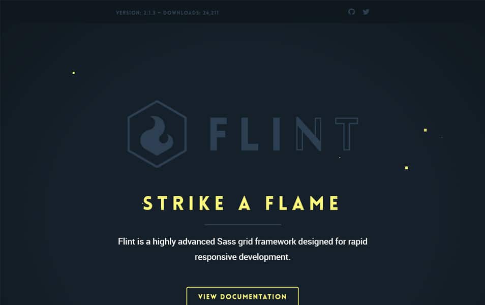
Flint is a highly advanced Sass grid framework designed for rapid responsive development.
Less Framework 4
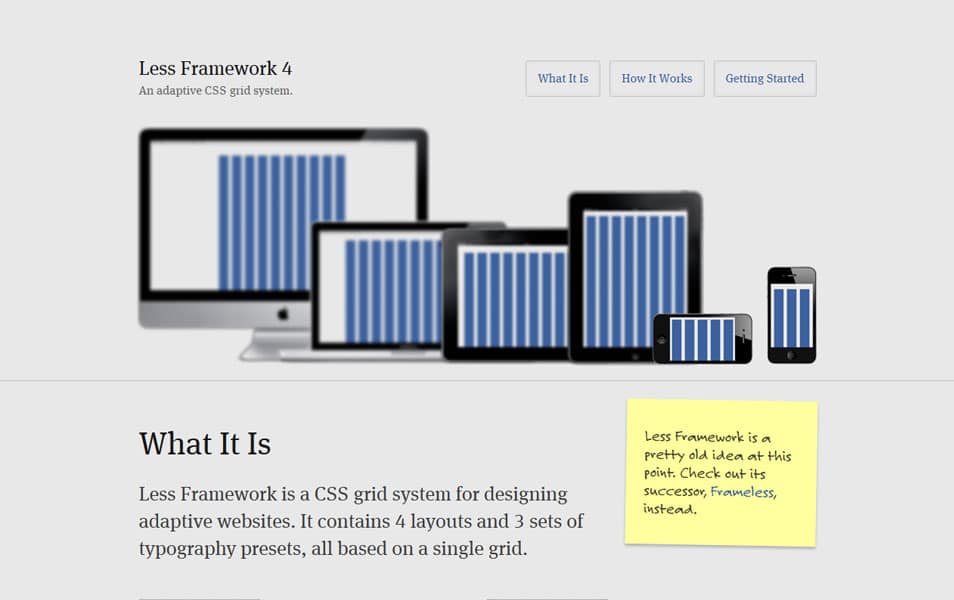
Less Framework is a CSS grid system for designing adaptive websites. It contains 4 layouts and 3 sets of typography presets, all based on a single grid.
Bourbon Neat
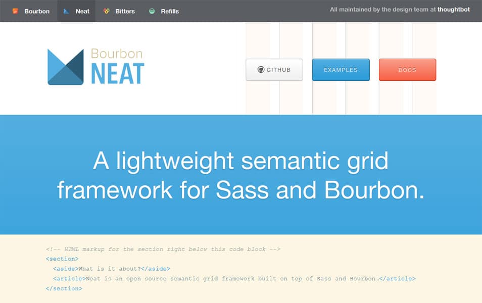
Neat is a semantic grid framework built on top of Sass and Bourbon. It is simple enough to get you up and running in minutes, and powerful enough to handle any responsive layout you can dream of.
Crow Grid Framework
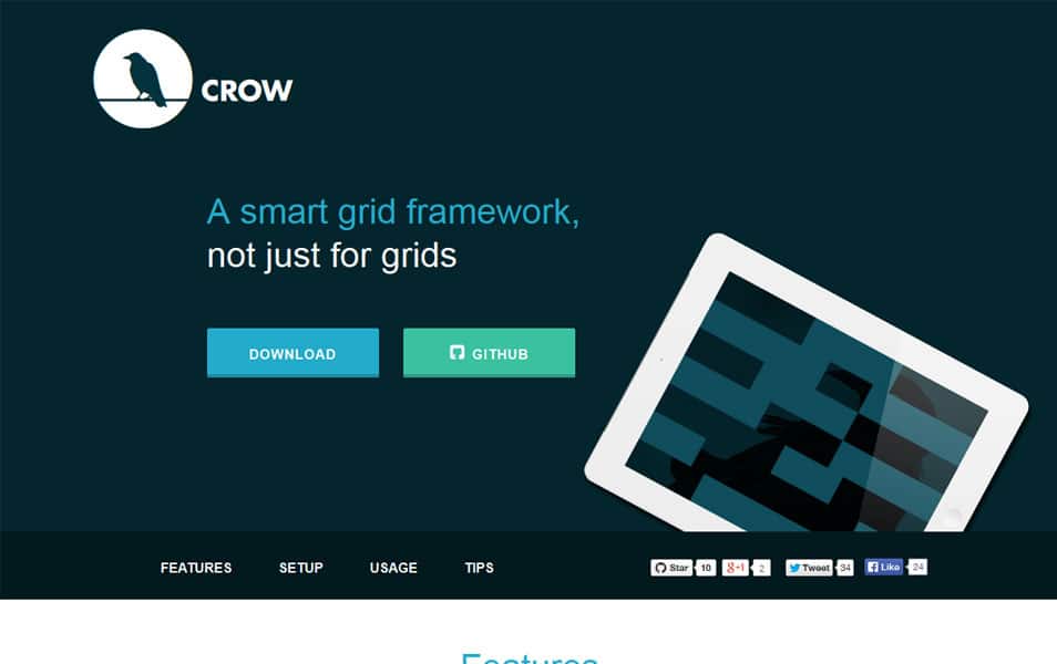
Crow is made standalone which means you can apply to any of your current markup/web project. Crow essentially stands for column-row.
IceCream
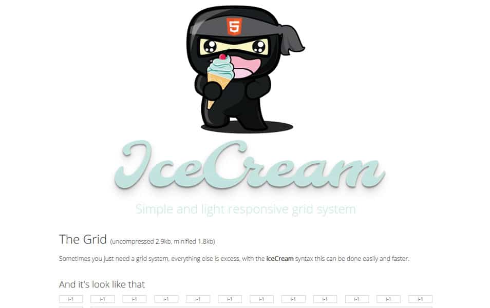
Simple and light responsive grid system.
Gridle
One grid system to rule them all (.scss). Gridle is a set of complete and simple settings, mixins and classes that make the creation and usage of grid systems (even complex ones) really simple. All of this with full responsive capabilities.
One% CSS Grid
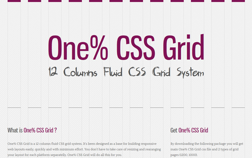
One% CSS Grid is a 12 column fluid CSS grid system. It’s been designed as a base for building responsive web layouts easily, quickly and with minimum effort. You don’t have to take care of resizing and rearanging your layout for each platform separatelly.
Columnal
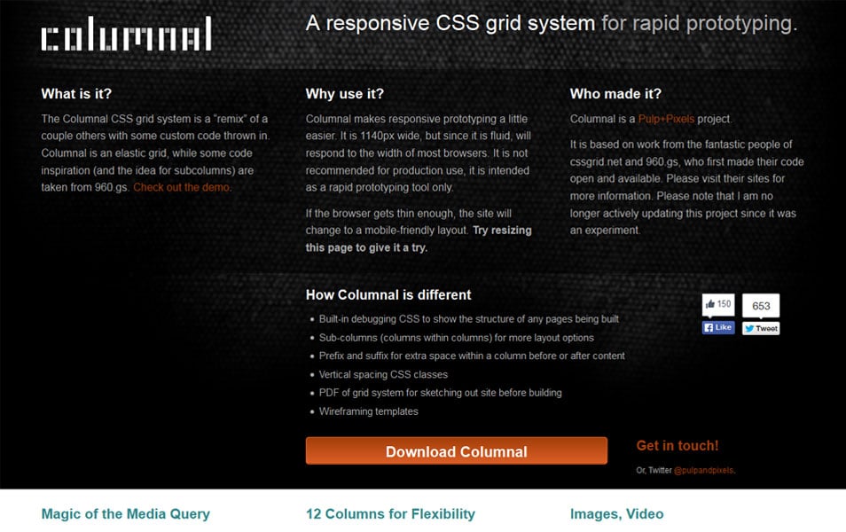
The Columnal CSS grid system is a “remix” of a couple others with some custom code thrown in. Columnal is an elastic grid, while some code inspiration (and the idea for subcolumns) are taken from 960.gs.
Responsive Grid System
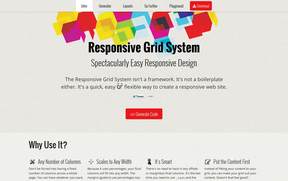
The Responsive Grid System isn’t a framework. It’s not a boilerplate either. It’s a quick, easy & flexible way to create a responsive web site.
Herow
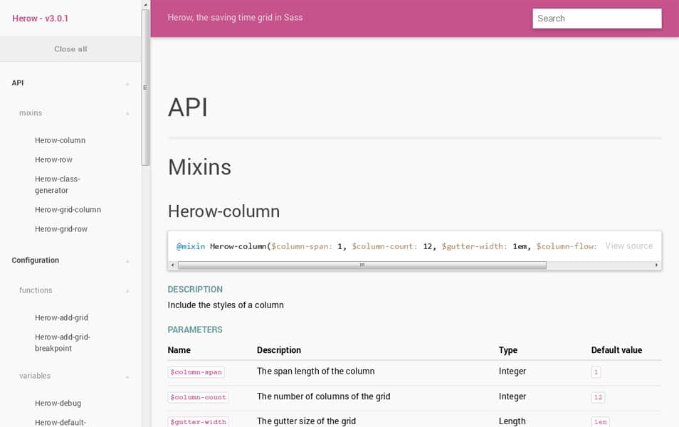
Herow, a time-saving Sass grid system. Herow provides mixins that are simple to use and easy to customize. It also provides atomic mixins, that are ideal to deal with responsive problematic. Last, but not least, you can generate atomic classes to play with it directly in CSS.
Girder
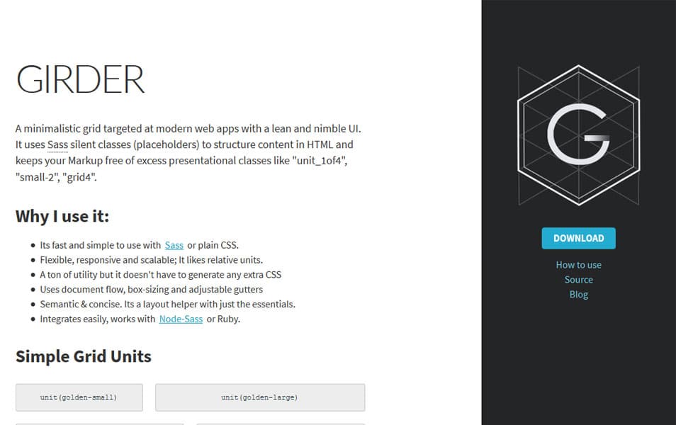
A simple CSS grid for building and prototyping modern websites. Its flexible, semantic and responsive.
Jaidee BlueSkyGrid System

The lightweight Responsive Grid Framework.
Zen Grids
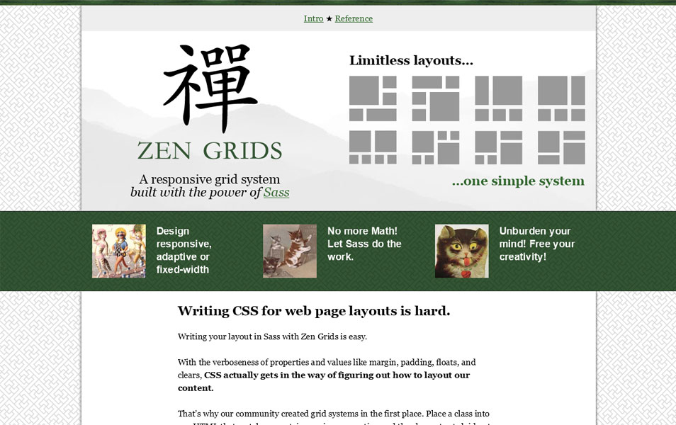
Zen Grids is a responsive grid system built with Compass and Sass.
Susy
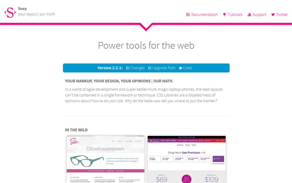
Susy is an agnostic set of tools for creating powerful, custom layouts. We provide the language, but you provide all the opinions. Use a grid, don’t use a grid, or use a combination of grids — it’s all up to you.
34 Responsive Grid System
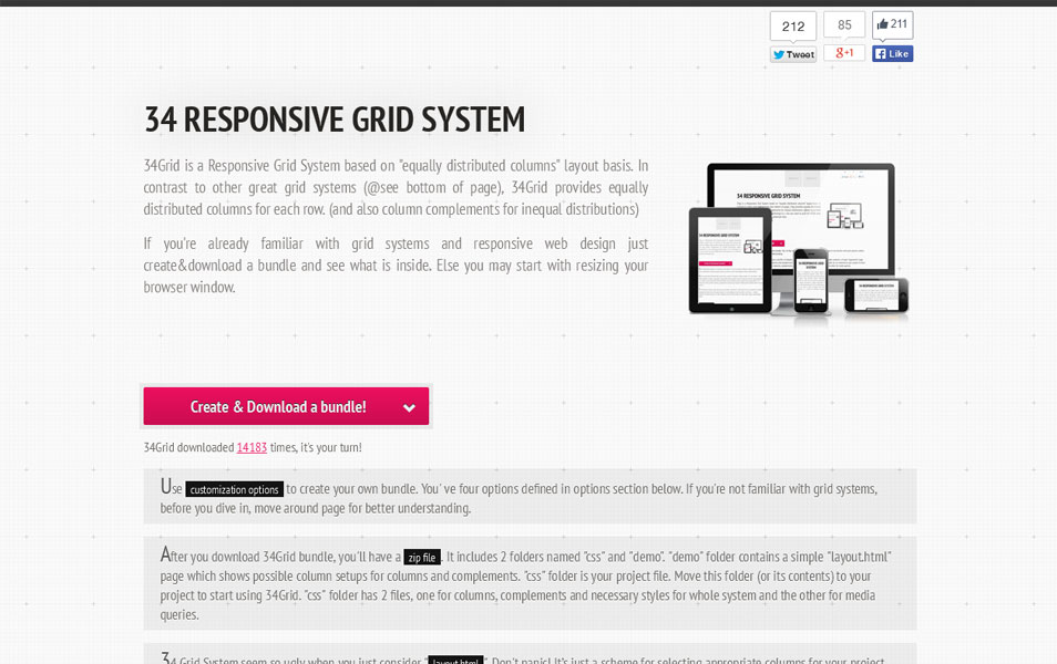
34Grid is a Responsive Grid System based on “equally distributed columns” layout basis. In contrast to other great grid systems (@see bottom of page), 34Grid provides equally distributed columns for each row. (and also column complements for inequal distributions).
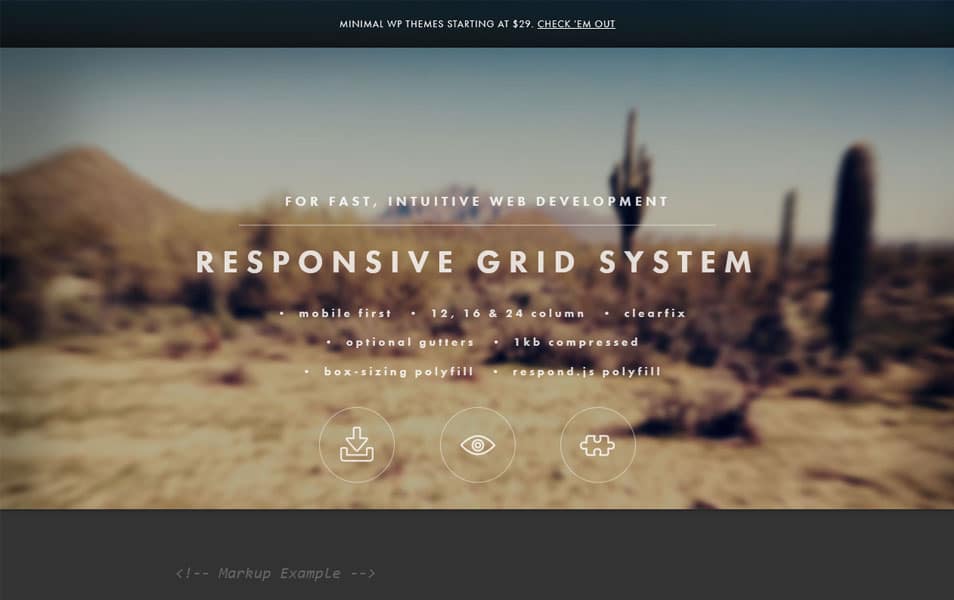
Responsive Grid System
Cute Grids
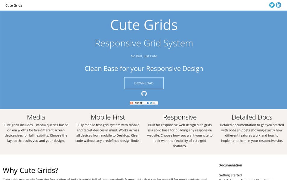
Cute Grids is a responsive grid system full of features to help designers and developers get started with their responsive layout.
Metro UI CSS Grid System
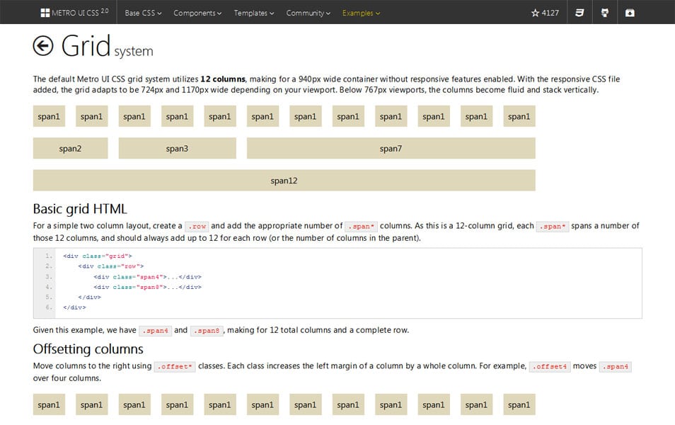
The default Metro UI CSS grid system utilizes 12 columns, making for a 940px wide container without responsive features enabled. With the responsive CSS file added, the grid adapts to be 724px and 1170px wide depending on your viewport. Below 767px viewports, the columns become fluid and stack vertically.
Gridiculous
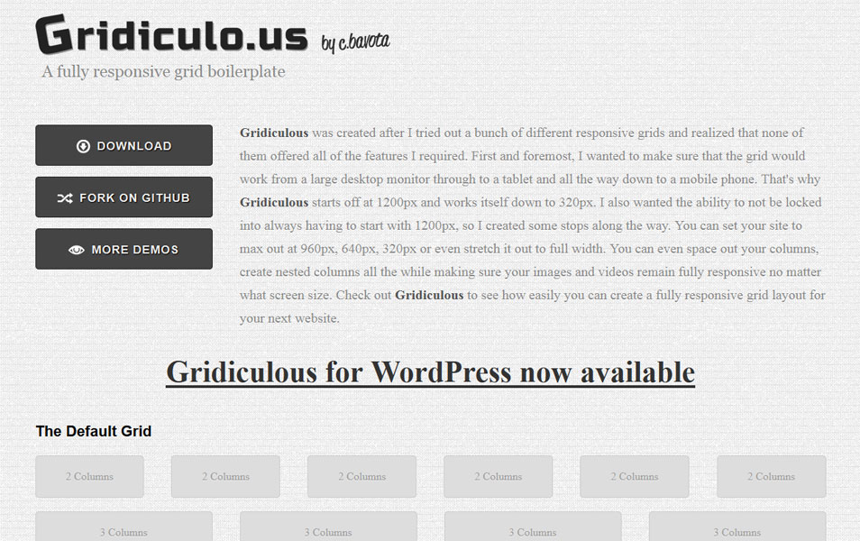
A fully responsive grid boilerplate that takes you all the way from 1200px on down to 320px.
Bijou CSS Framework
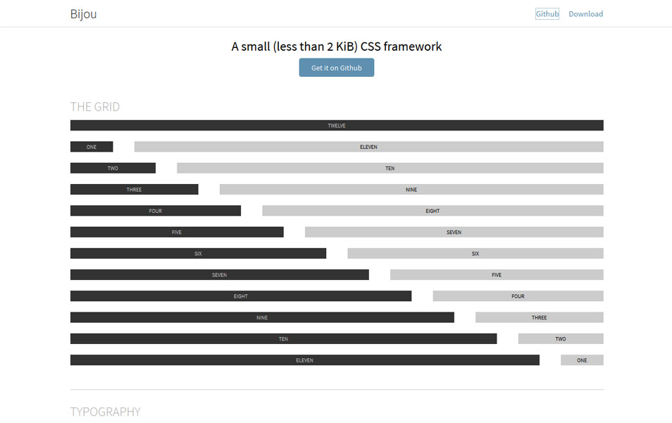
A small (Less than 2kb) CSS framework.
Maze
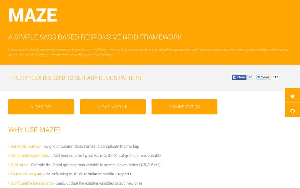
Maze is a flexible & semantic responsive grid built with Sass. Maze is fully customisable with editable options for total grid columns, column span, gutter widths, break points and push values. Maze supports both column layouts and ratios.
Simple Grid Framework
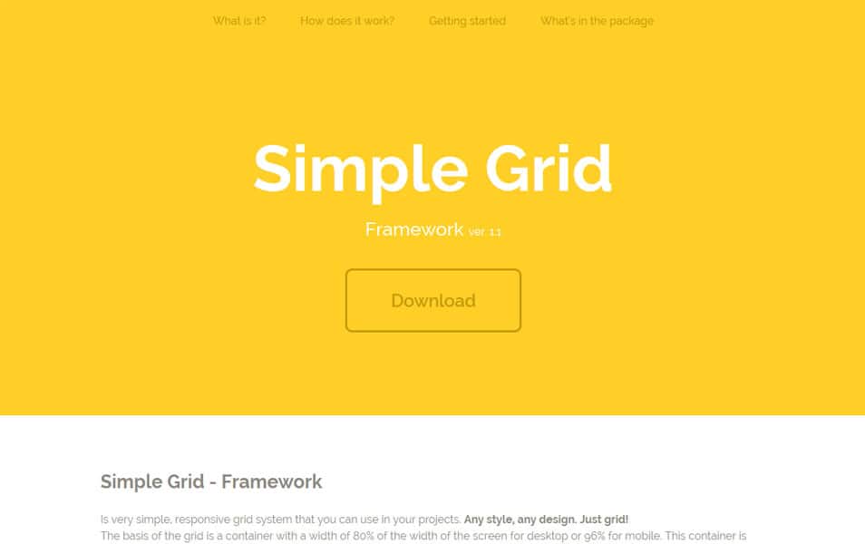
Simple Grid is very simple, responsive grid system that you can use in your projects. Any style, any design. Just grid! The basis of the grid is a container with a width of 80% of the width of the screen for desktop or 96% for mobile. This container is divided into 12 columns. So no matter what device, your website will be broad at 80% or 96%. Always!
Skel
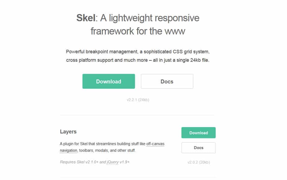
Powerful breakpoint management, a sophisticated CSS grid system, cross platform support and much more – all in just a single 24kb file.
Toast Framework
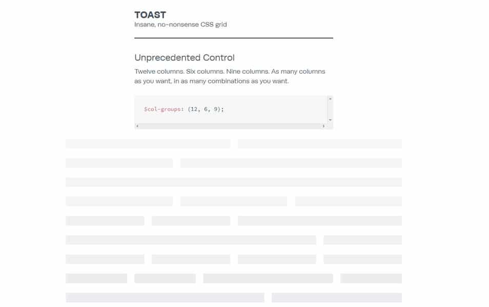
The Toast framework is a grid. That’s it. Soon, it might have type styles and whatnot, but its power is in its highly customisable design.
Flexible Grid System
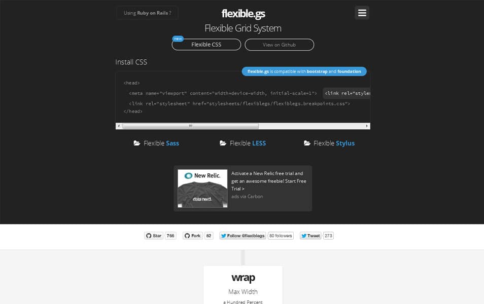
Flexible Grid System is a Responsive CSS Framework (CSS, Sass, LESS and Stylus).
The Square Grid
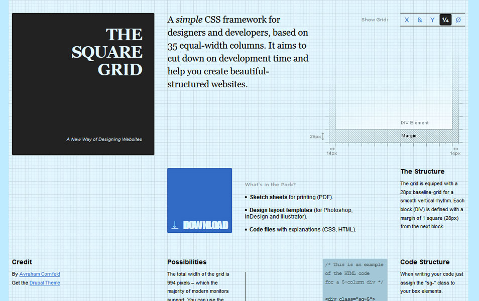
A simple CSS framework for designers and developers.
Singularity Grid System

Singularity is a next generation grid framework built from the ground up to be responsive.
Rebar Grid Framework
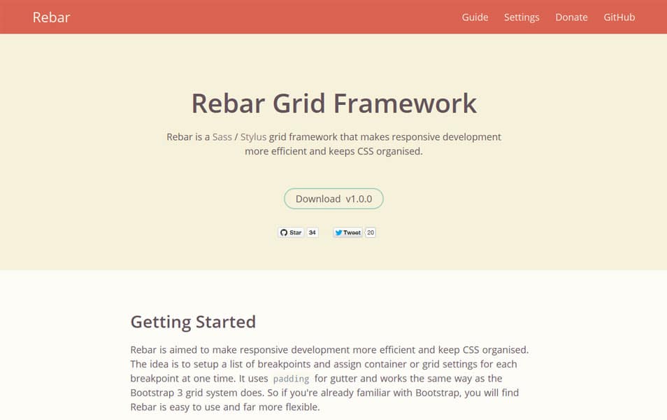
Rebar is a Sass / Stylus grid framework that makes responsive development more efficient and keeps CSS organised.
Concrete
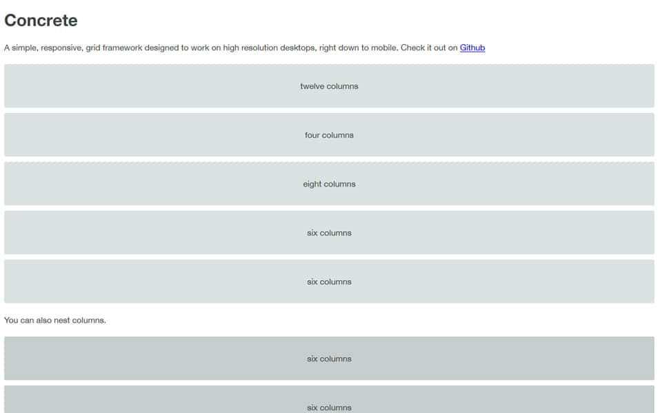
A simple, responsive, grid framework designed to work on high resolution desktops, right down to mobile.
Golden Grid System
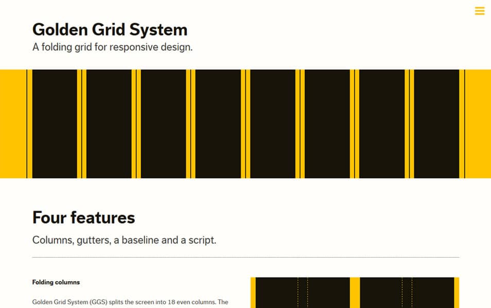
Golden Grid System (GGS) splits the screen into 18 even columns. The leftmost and rightmost columns are used as the outer margins of the grid, which leaves 16 columns for use in design.
Profound Grid
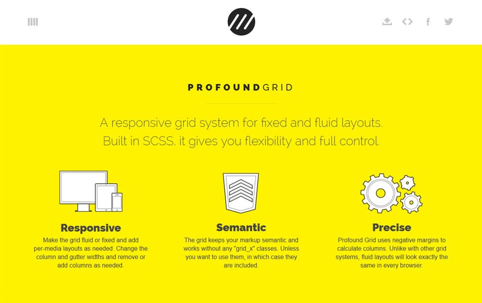
A responsive grid system for fixed and fluid layouts. Built in SCSS, it gives you flexibility and full control.
Jeet Grid System

Jeet is the most advanced, yet intuitive, grid system on the market today. You can think of it like the spiritual successor to Semantic.gs.
MUELLER GRID SYSTEM
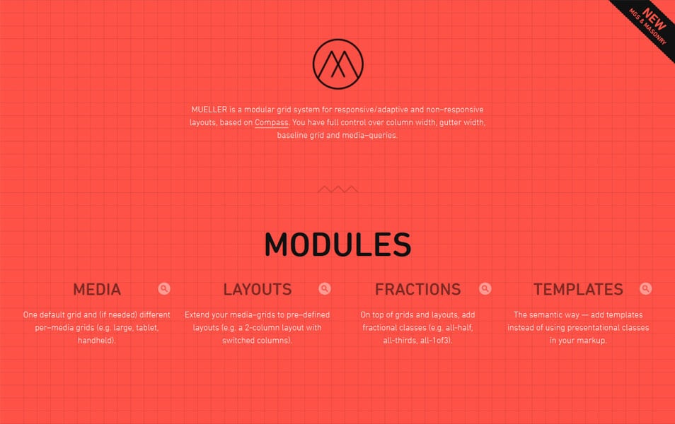
MUELLER is a modular grid system for responsive/adaptive and non–responsive layouts, based on Compass. You have full control over column width, gutter width, baseline grid and media–queries.
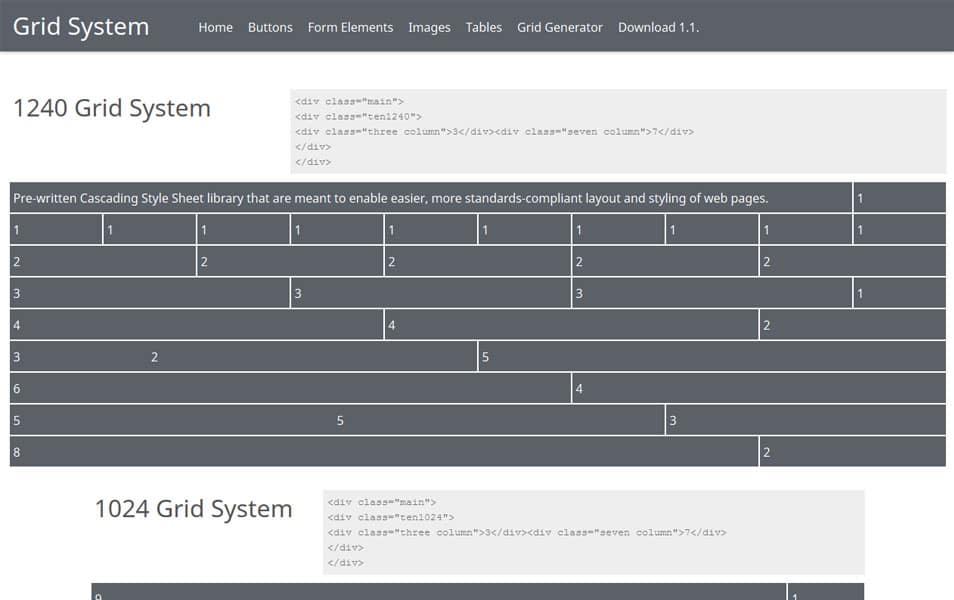
1200px Grid System
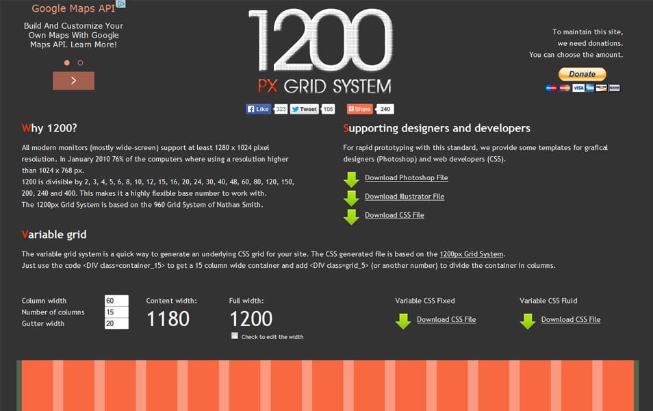
All modern monitors (mostly wide-screen) support at least 1280 x 1024 pixel resolution. In January 2010 76% of the computers where using a resolution higher than 1024 x 768 px.
Rwdgrid
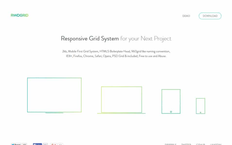
rwdgrid is just another Grid system based on popular 960grid, which is responsive and ranges from mobile, tablet, laptops and wide screen displays. Naming convention is very similar to 960 grid system, where underscore is replaced by hyphen (increases readabilty).
Extra Strength Responsive Grids

A Fluid CSS Grid System for Responsive Web Design The Fluid CSS Grid System for Responsive Web Design. Take total control of your layouts.
PocketGrid
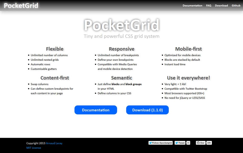
PocketGrid is a lightweight pure CSS grid system for Responsive Web Design. Moreover, it is semantic, mobile-first, and allows to have an unlimited number of columns and breakpoints.
Simple Grid
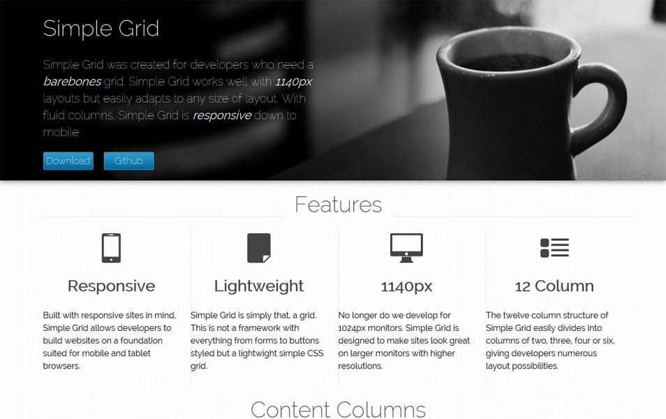
Simple Grid was created for developers who need a barebones grid. Simple Grid works well with 1140px layouts but easily adapts to any size of layout. With fluid columns, Simple Grid is responsive down to mobile.
Frameless Grid
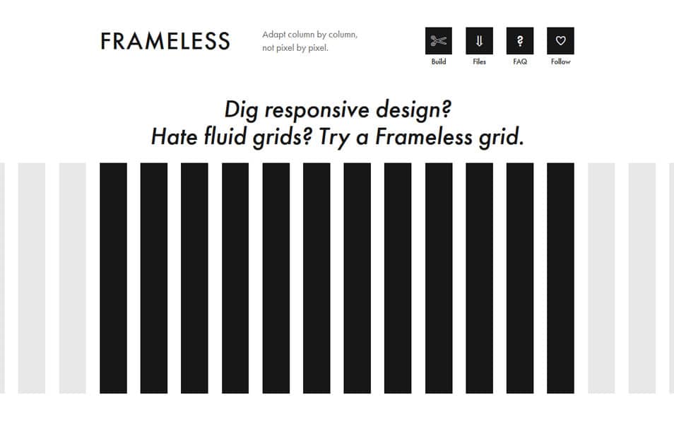
Dig responsive design? Hate fluid grids? Try a Frameless grid.
Unit Grid System
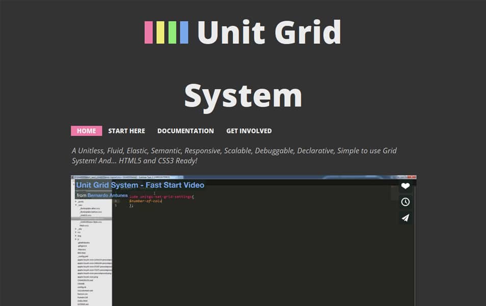
A Unitless, Fluid, Elastic, Semantic, Responsive, Scalable, Debuggable, Declarative, Simple to use Grid System! And… HTML5 and CSS3 Ready!
Flexbox Grid
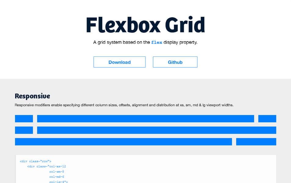
A grid system based on the flex display property.
Responsive Aeon
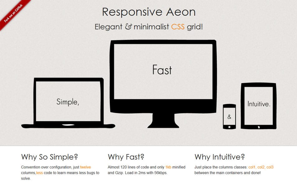
A simple and minimalist alternative to start with Responsive Design and fluid Grids for WebDesigners.
Csswizardry-Grids
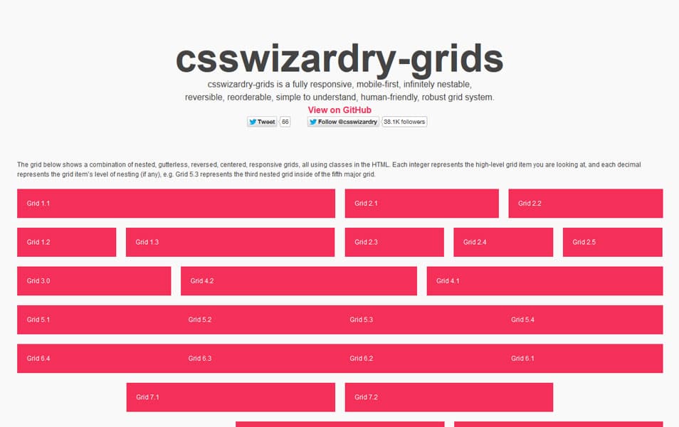
csswizardry-grids is a fully responsive, mobile-first, infinitely nestable, reversible, reorderable, simple to understand, human-friendly, robust grid system.
CSS Smart Grid
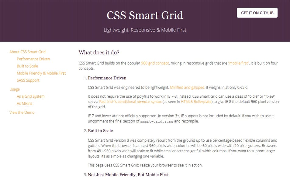
Lightweight, Responsive, Mobile First Grid System.
.Fitgrd
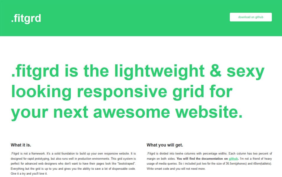
.fitgrd is the lightweight & sexy looking responsive grid for your next awesome website.
1140px Responsive CSS
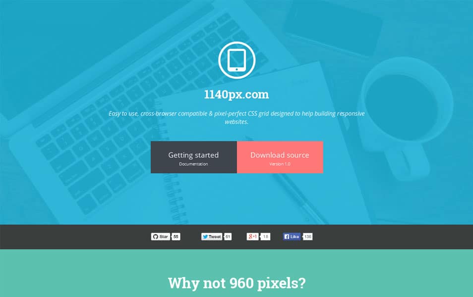
Easy to use, cross-browser compatible & pixel-perfect CSS grid designed to help building responsive websites.
Ink
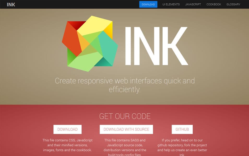
Ink is an interface kit for quick development of web interfaces, simple to use and expand on. It uses a combination of HTML, CSS and JavaScript to offer modern solutions for building layouts, display common interface elements and implement interactive features that are content-centric and user friendly for both your audience and your designers & developers.
Proportional Grids
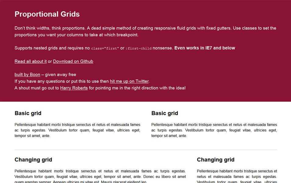
Don’t think widths, think proportions. A dead simple method of creating responsive fluid grids with fixed gutters. Use classes to set the proportions you want your columns to take at which breakpoint.
Dgrid
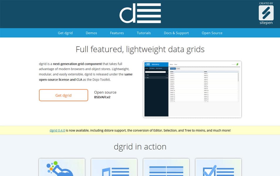
dgrid is a next-generation grid component that takes full advantage of modern browsers and object stores. Lightweight, modular, and easily extensible, dgrid is released under the same open-source license and CLA as the Dojo Toolkit.
FGrid
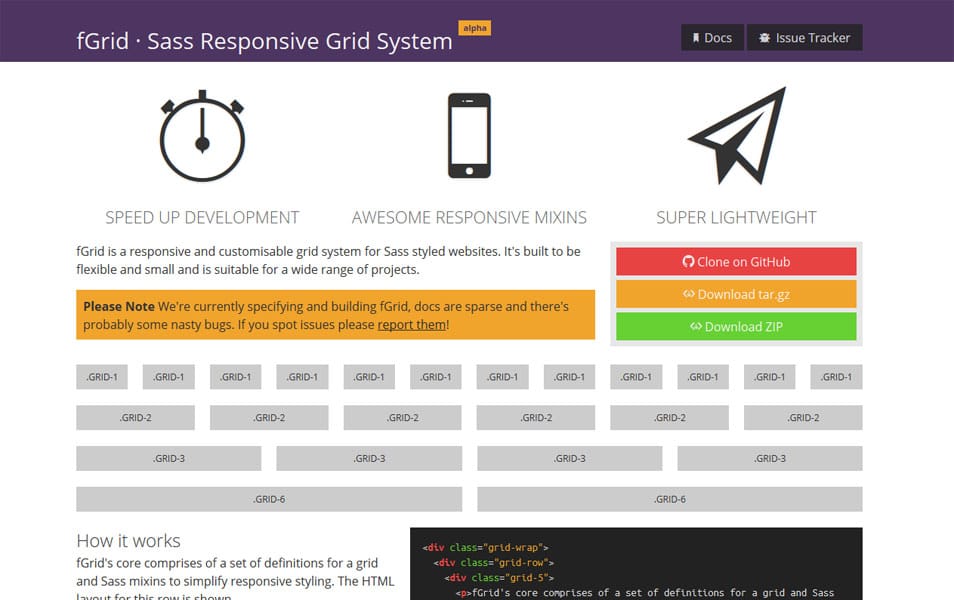
fGrid is a responsive and customisable grid system for Sass styled websites. It’s built to be flexible and small and is suitable for a wide range of projects.
Mice
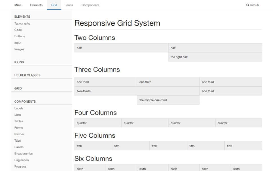
Mice is semantic front-end framework.
The Semantic Grid System
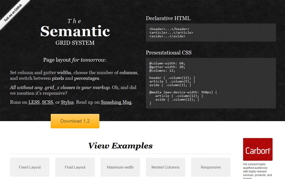
The Semantic Grid System is a modern approach to the CSS grid. It allows you to set column and gutter widths, choose the number of columns, switch between pixels and percentages, and achieve responsive layouts, all without any unsemantic .grid_x classes in your markup.
Fluidable

Fluidable is a mobile first, responsive grid system that has fixed gutters and supports variable columns. It is standalone, lightweight & built using LESS.
1080 Grid System
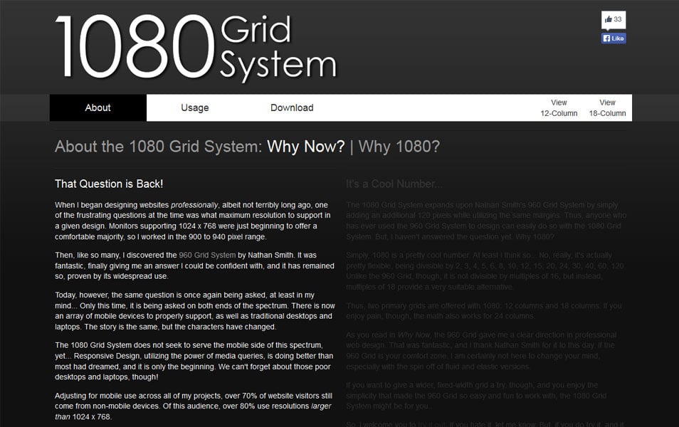
The 1080 Grid System does not seek to serve the mobile side of this spectrum, yet… Responsive Design, utilizing the power of media queries, is doing better than most had dreamed, and it is only the beginning.
SimpleGrid
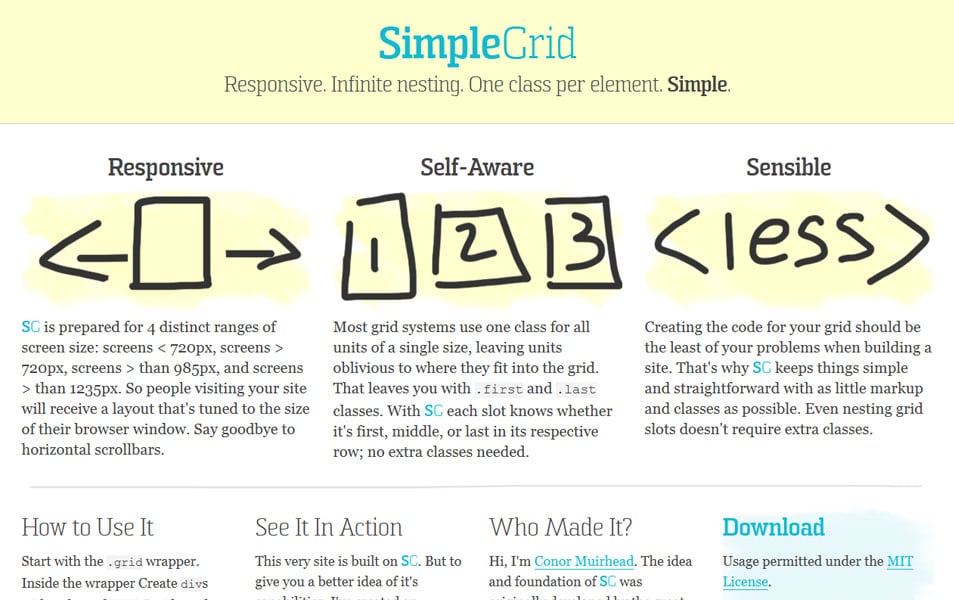
Responsive. Infinite nesting. One class per element. Simple.
Grid System
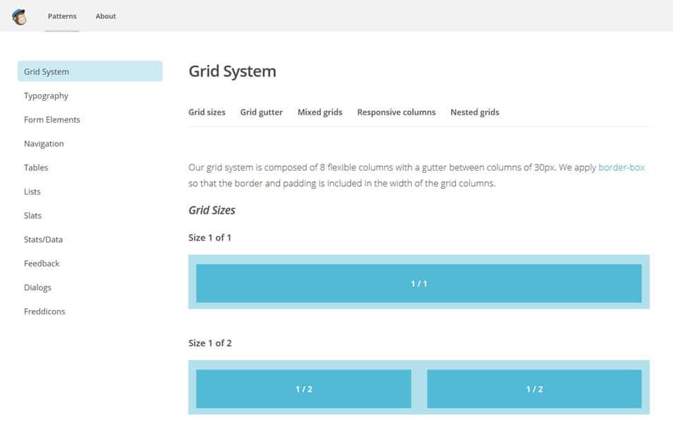
Our grid system is composed of 8 flexible columns with a gutter between columns of 30px. We apply border-box so that the border and padding is included in the width of the grid columns.
Grid Based Front-end Frameworks
UnlimitedGrid
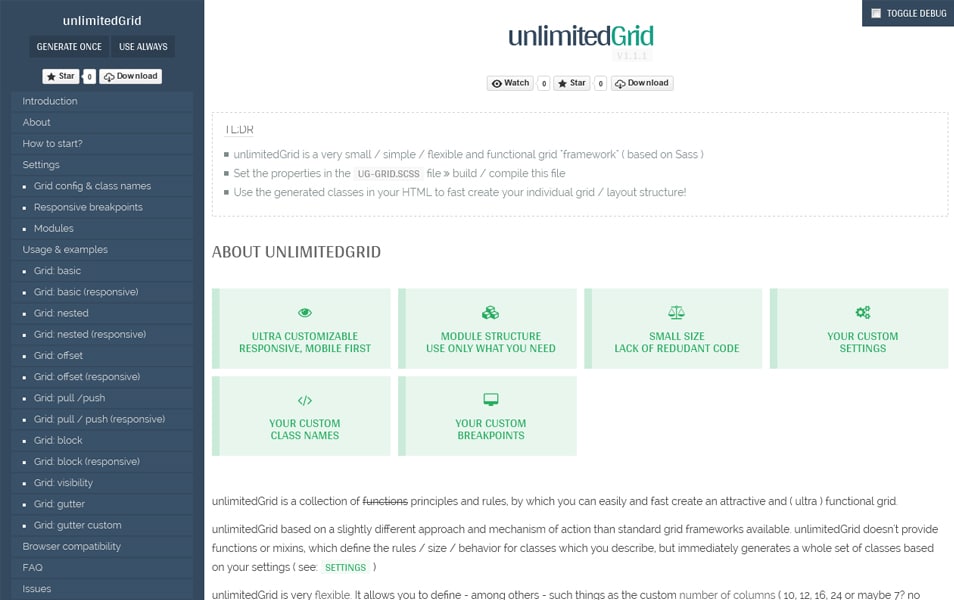
unlimitedGrid is a collection of functions principles and rules, by which you can easily and fast create an attractive and ( ultra ) functional grid.
Responsive Cat
Grid and block system for Responsive Cat.
Milligrid
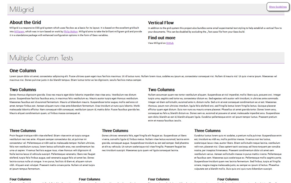
Milligrid is a responsive CSS grid system which uses flex-box as a basis for its layout.
Gumby Framework
The Gumby Framework offers customizable, flexible & responsive CSS grids including a hybrid grid.
Foundation
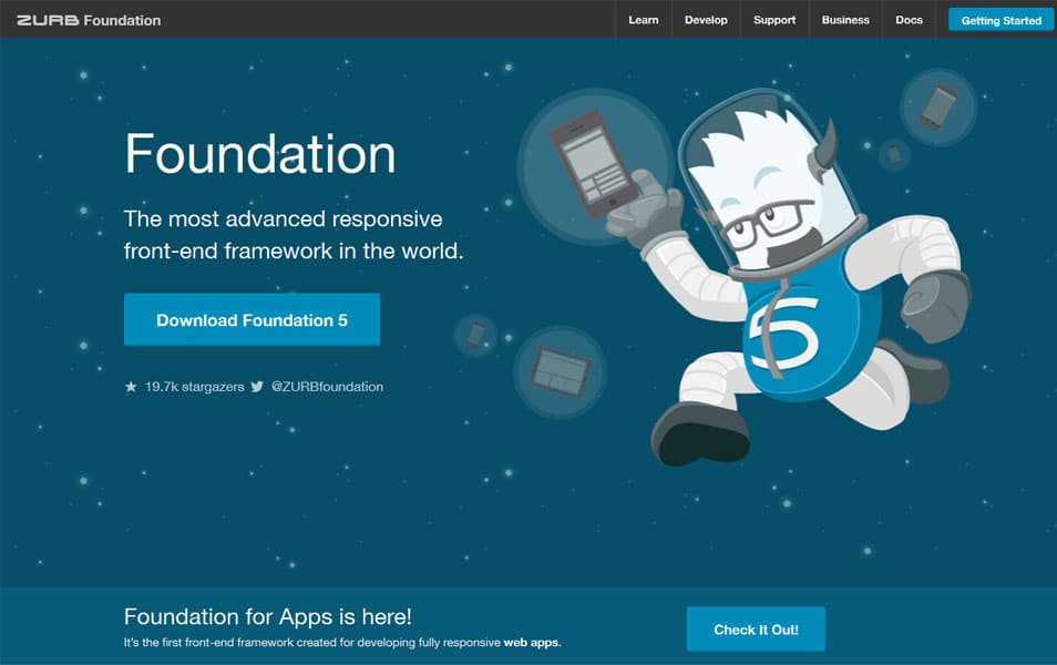
The Most Advanced Responsive Front-end Framework from ZURB. It’s a 12-column flexible grid that can scale out to an arbitrary size (defined by the max-width of the row) that’s also easily nested, so you can build out complicated layouts without creating a lot of custom elements. And when the Grid isn’t enough for your site, it just gets out of the way.
YAML CSS Framework
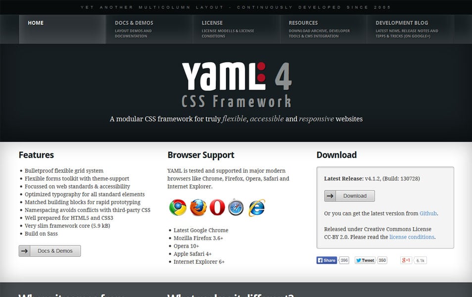
A modular CSS framework for truly flexible, accessible and responsive websites.
Amazium
The clean & simple responsive framework.
Bootstrap
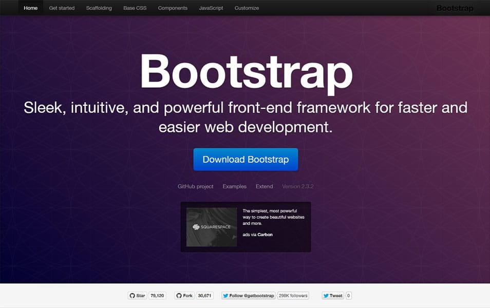
Bootstrap includes a responsive, mobile first fluid grid system that appropriately scales up to 12 columns as the device or viewport size increases. It includes predefined classes for easy layout options, as well as powerful mixins for generating more semantic layouts.
CSS Grid Framework
IVORY Framework

The default IVORY povides four various widely used containers – 1200px, 1140px, 1024px, 960px. IVORY grid system utilizes 12 columns, with fluid responsive features enabled. Below 768px viewports, the columns become stack vertically.
Base
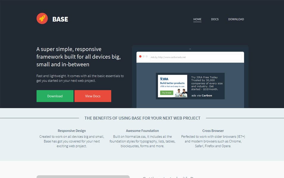
A super simple, responsive framework designed to work for mobile devices, tablets, netbooks and desktop computers.
Kube Web Framework
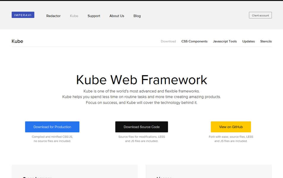
Kube is a minimalistic Web framework for professional developers and designers.
YJ Simple Grid

Flexible, effective and easy-to-use Template Framework ready for your next web development project.
Blueprint
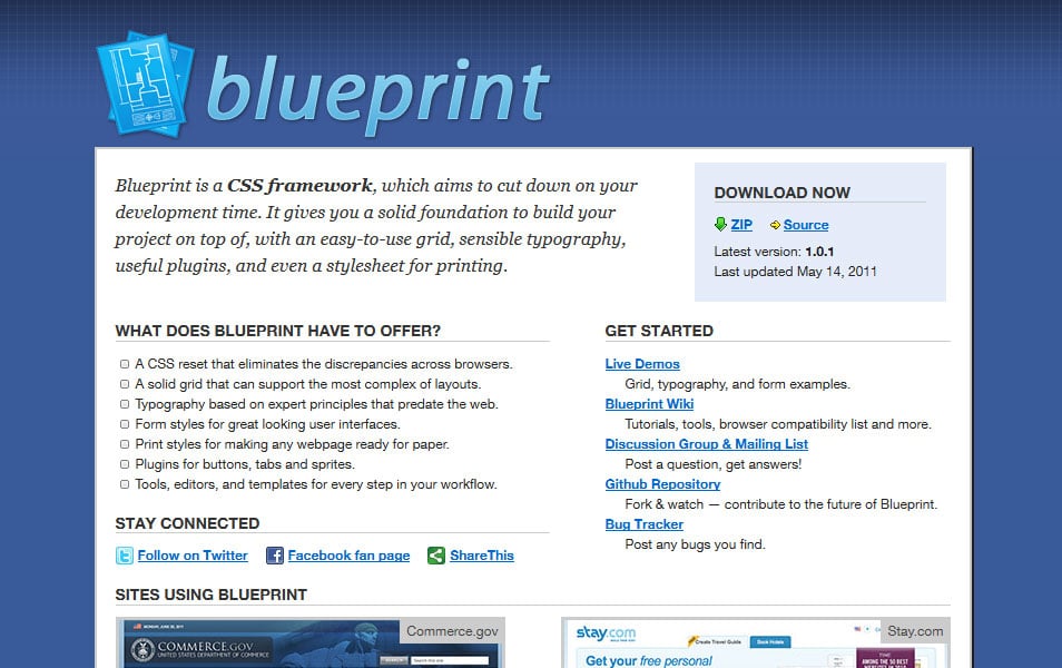
Blueprint is a CSS framework, which aims to cut down on your development time. It gives you a solid foundation to build your project on top of, with an easy-to-use grid, sensible typography, useful plugins, and even a stylesheet for printing.
Cascade Framework
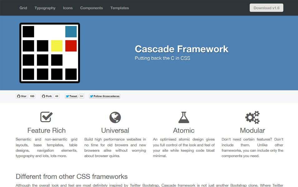
Cascade framework provides the following normalised default behavior for the section, main, article, header, footer, aside and nav elements, to make it easier for these elements to use them for defining your grid.
Responsable Framework
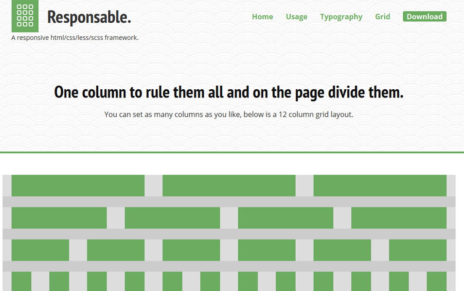
A clean responsive grid system with a typographic baseline powered by LESS/SCSS, based on Semantic.gs.
KNACSS
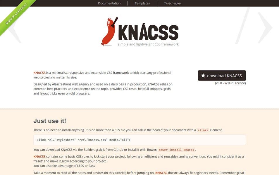
KNACSS is a minimalist, responsive and extensible CSS framework to kick-start any professional web project no matter its size.
Pure
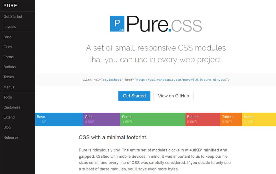
Pure Grids are easy to work with, and very powerful.
Flurid
The Fluid CSS Grid Framework.
Furatto
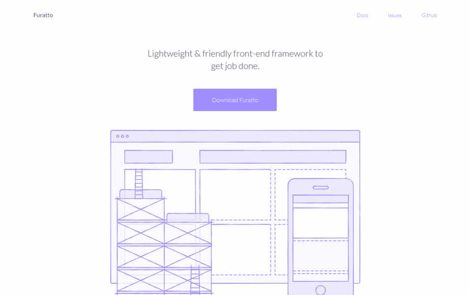
It’s a flat, fast and powerful front-end framework for rapid web development.
GroundworkCSS 2
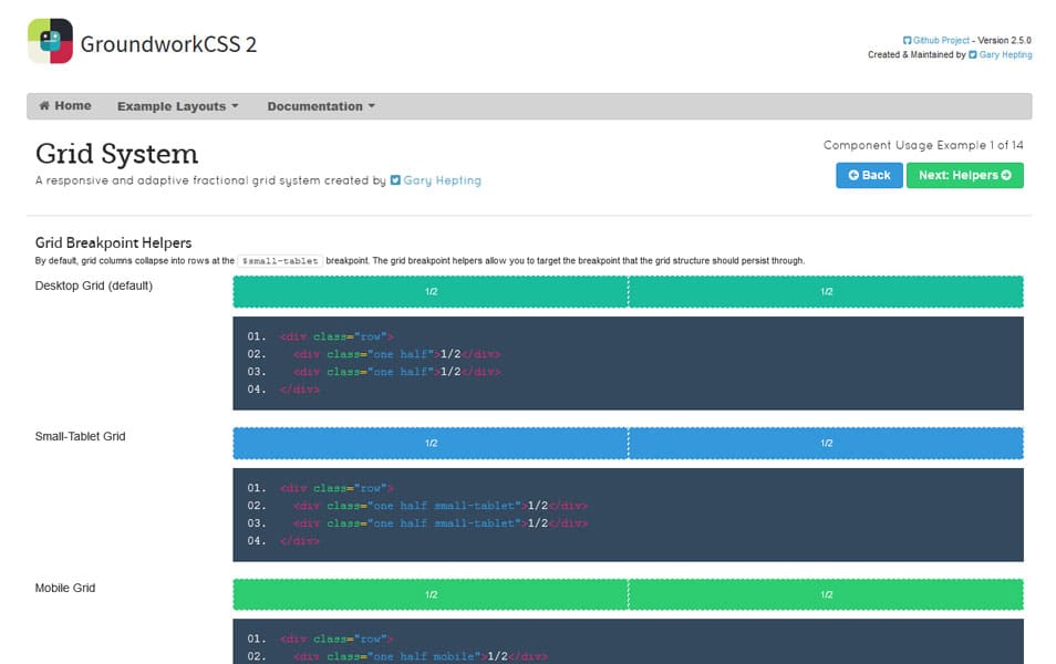
A responsive and adaptive fractional grid system.
Grid Generators
Gridpak
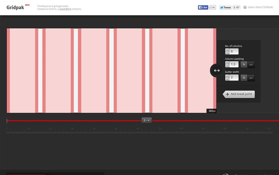
The Responsive grid generator.
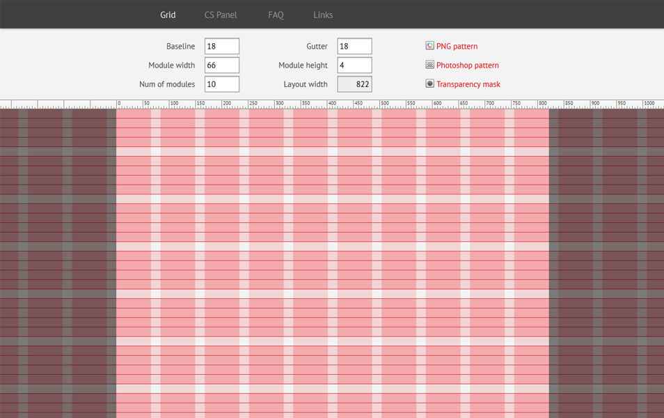
Modular Grid Pattern
Variable Grid System

The variable grid system is a quick way to generate an underlying CSS grid for your site. The CSS generated file is based on the 960 Grid System.
ZURB CSS Grid Builder
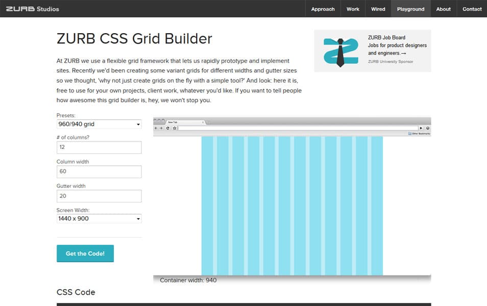
At ZURB we use a flexible grid framework that lets us rapidly prototype and implement sites. Recently we’d been creating some variant grids for different widths and gutter sizes so we thought, ‘why not just create grids on the fly with a simple tool?’ And look: here it is, free to use for your own projects, client work, whatever you’d like. If you want to tell people how awesome this grid builder is, hey, we won’t stop you.
Tiny Fluid Grid
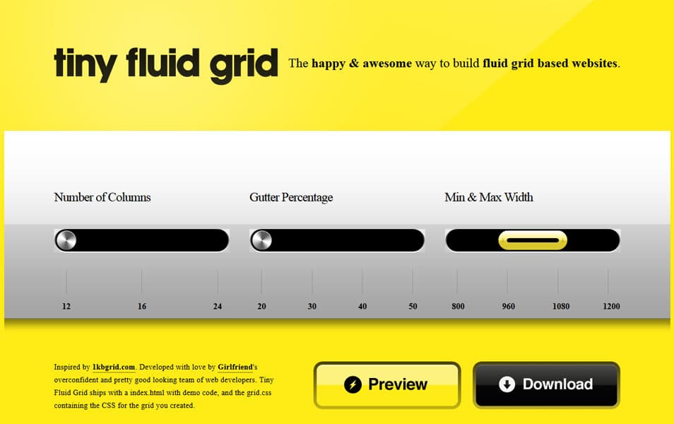
The happy & awesome way to build fluid grid based websites.
Gridulator
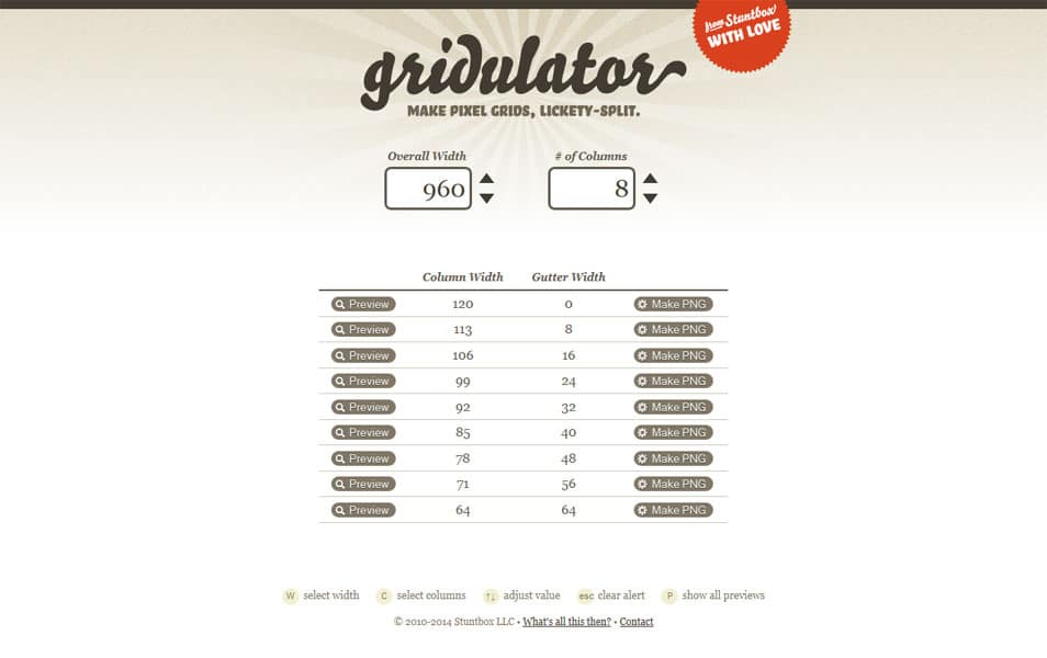
Make pixel grids, lickety-split.
Grid System Generator
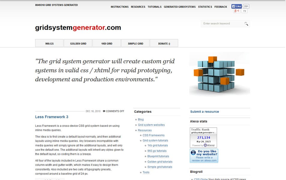
The grid system generator will create custom grid systems in valid css / xhtml for rapid prototyping, development and production environments.
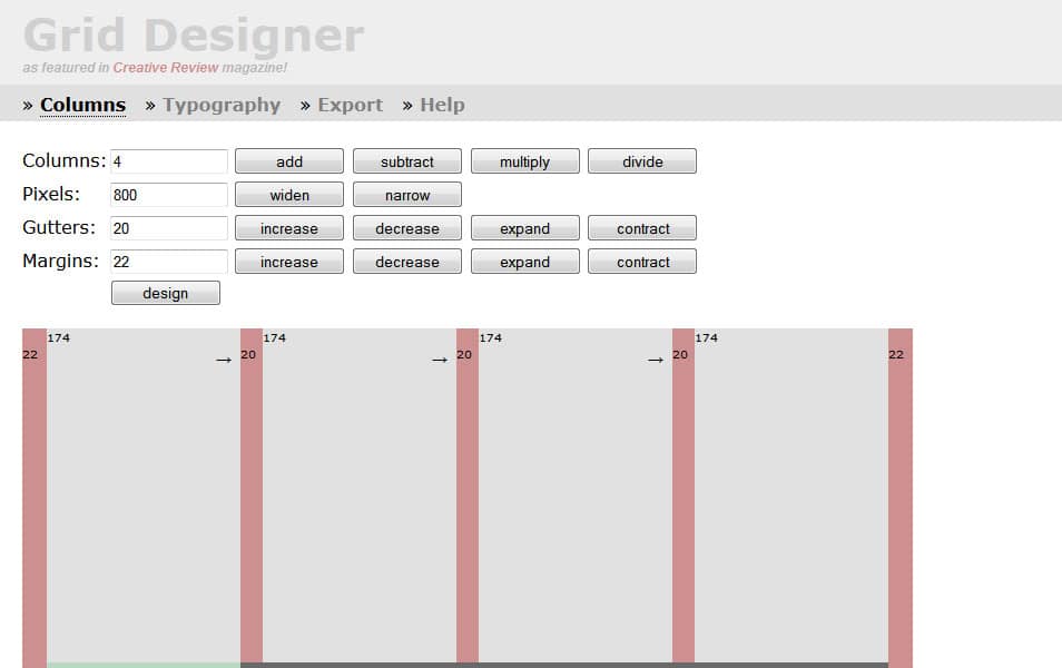
Grid Designer
Blueprint Grid CSS Generator
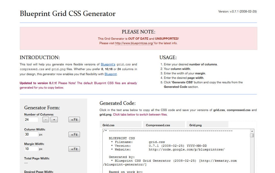
This tool will help you generate more flexible versions of Blueprint’s grid.css and compressed.css and grid.png files. Whether you prefer 8, 10,16 or 24 columns in your design, this generator now enables you that flexibility with Blueprint.
Gridset

Fully-custom grids for responsive layouts.
Shoelace
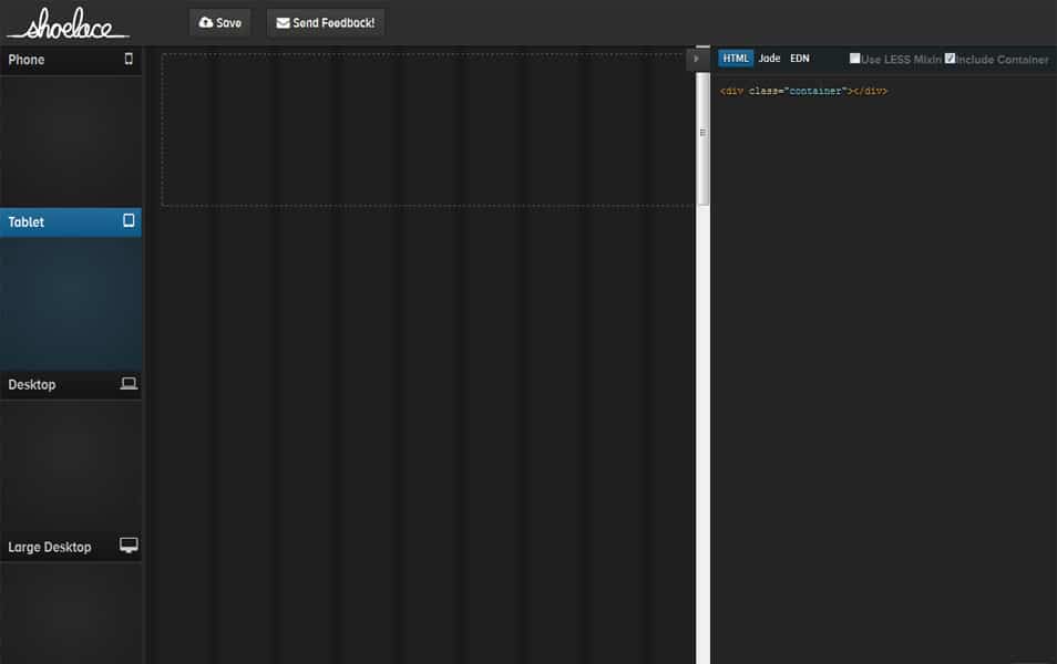
Visual Bootstrap 3 Grid Builder.
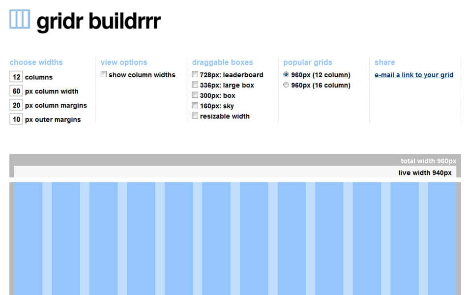
Gridr Buildrrr
The Responsive Calculator
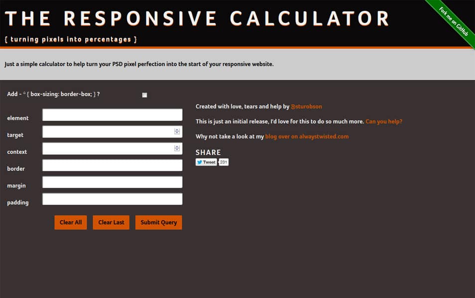
Just a simple calculator to help turn your PSD pixel perfection into the start of your responsive website.
Modular Scale
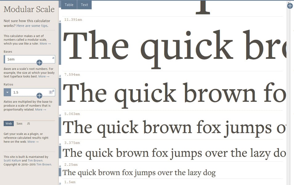
This calculator makes a set of numbers called a modular scale, which you use like a ruler.
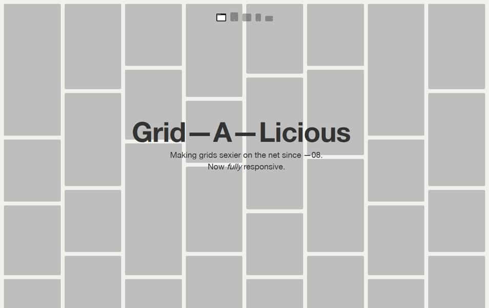
Grid—A—Licious
Cedvel
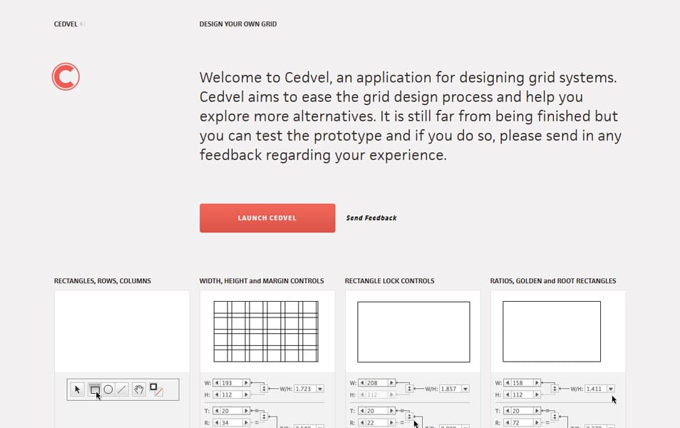
An application for designing grid systems. Cedvel aims to ease the grid design process and help you explore more alternatives. It is still far from being finished but you can test the prototype and if you do so, please send in any feedback regarding your experience.
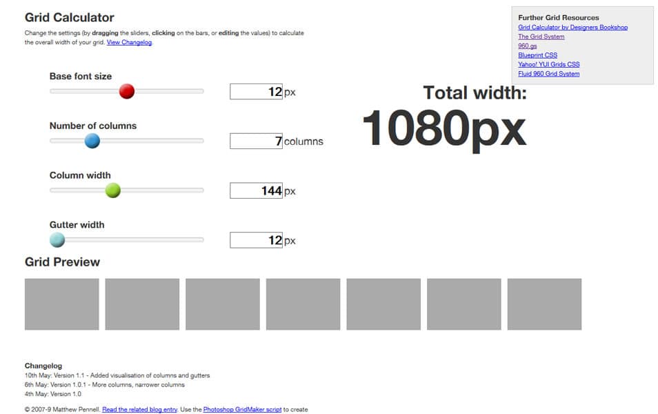
Grid Calculator
Grid Design Tools
GuideGuide
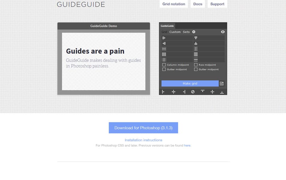
GuideGuide is a Photoshop extension that allows you to easily create grids with guides.
ScreenQueries
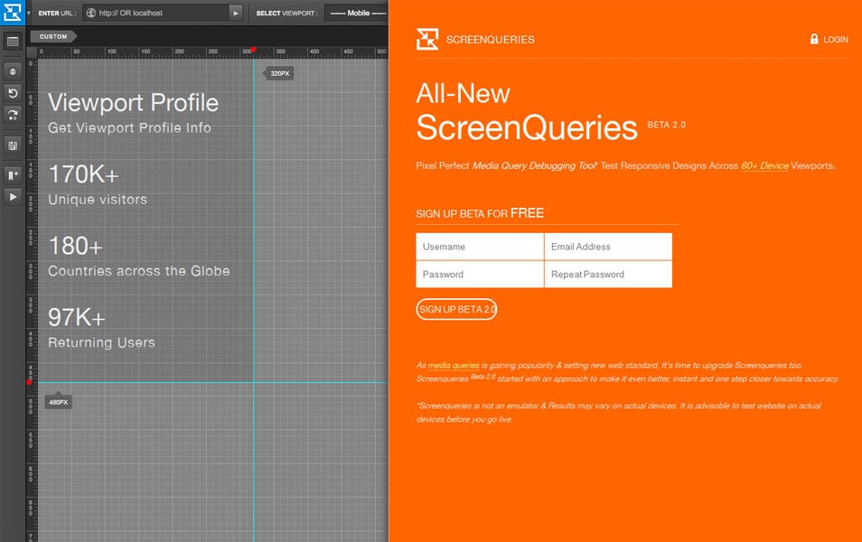
Pixel Perfect Media Query Debugging Tool. Test Responsive Designs Across 60+ Device Viewports.
Grid Displayer
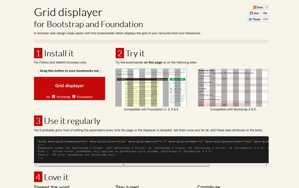
Grid displayer bookmarklet for Twitter Bootstrap and ZURB Foundation. In-browser web design made easier with this bookmarklet which displays the grid of your favourite front-end framework.
Responsify
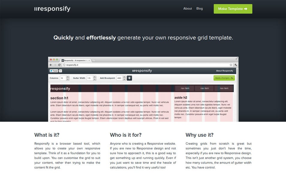
Responsify is a browser based tool, which allows you to create your own responsive template. Think of it as a foundation for you to build upon. You can customise the grid to suit your content, rather than trying to make the content fit the grid.
Boks – A Visual Grid Editor
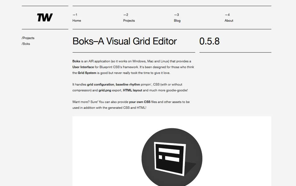
Boks is an AIR application (so it works on Windows, Mac and Linux) that provides a User Interface for Blueprint CSS’s framework. It’s been designed for those who think the Grid System is good but never really took the time to give it love.
#Grid
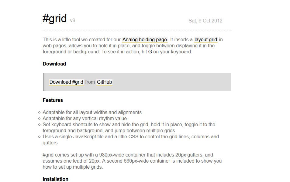
A little tool that inserts a layout grid in web pages, allows you to hold it in place, and toggle between displaying it in the foreground or background.
Originally posted at CSSAuthor