Many people think that traffic equals sales, so the more people visit your site, the more sales it gets. This seems logical but in reality things don’t work like that. In real life traffic doesn’t necessarily mean sales.
Why does it happen? The thing is that it’s not enough to just attract a potential buyer to your site, it’s also important to make him complete your goal (registration, order, etc.). To make this possible a visitor should find answers to all the questions about you and your products without any efforts. You can achieve that by taking into account some important things while designing your landing pages. Follow the tips below; they will help you to achieve seamless user experience in your store.
1. Logo and name
Create a beautiful and catchy logo. A customer may not buy anything from you but at least he will remember your logo and next time you will already be familiar to him. Moreover, people tend to choose the companies they already know: if they need to choose a product from you or your competitor they see for the first time, you are more likely to get a new customer.
2. Contact information and checkout
Having contact information on your site is a must, no matter whether you sell online or offline. The latter also requires adding a physical address where customers can see your products on display.
If your products can be bought online, you need to have a shopping cart and checkout. Their optimization is a topic for another post, but there is one word that will help you to organize a good checkout process – user-friendliness. Try to always keep it in mind when designing a new website.

3. Good slogan
Google gives the following definition of “slogan”: a short and striking or memorable phrase used in advertising. The key words here are “striking” and “memorable” as a slogan should generate a positive emotional response and be catchy.
A slogan is a small but very important part of your brand building and store in general. It’s not enough to say just “We are the best”. You should state in which sphere you have succeeded and why people should choose you.
Your logo, slogan and contact info should always be visible to customers, so it’s better to place them in the header and/or in footer of your online store.

4. Noticeable and speaking product names
A product name plays an important role in the process of online shopping. Names like “Item 678” are not likely to generate lots of sales juts because they are boring and not descriptive. Instead you can use the names that promise to solve the problem of your potential client right away. Don’t forget that products URLs should also be clean and descriptive.
5. Price
No matter whether your price is low or high, indicate it! Personally I hate navigating through a site offering some service in search of the price. Of course, there are some exceptions: you can have custom plans or wholesale prices for some customer groups or some other terms that can be negotiated. But anyway, it’s better to show the price on your general products to your common customers.
If you have something free, show it too! If you offer a free eBook download or need customers to complete a form, mention that it’s completely free. The word “free” is a magic trigger that can increase your conversions dramatically.
You can also indicate availability of your product if it’s applicable: in stock, out of stock, can be pre ordered, etc.

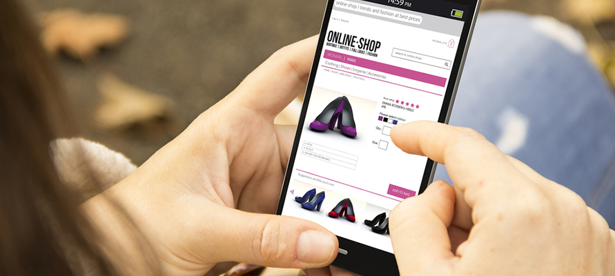
6. Images
Would you buy a car just because somebody says it’s good but you don’t have a single picture of it? I wouldn’t. So think about your customers and provide them with the information they really need.
Product images help to understand how the product looks like and how it can be used. They play an extremely important role in online shopping where customers can’t touch items. Your goal is to sell more so show your products using high-quality and attractive pictures. Don’t forget to optimize them aspage speed is also an important factor for visitors and search engines.

7. Key benefits
You may be surprised but few people will read full description of your product no matter how good it is. People prefer scanning in search of most important data. You can use by adding bullet points with key benefits of your goods. This simplifies and speeds up navigation and decision-making process.

8. Call to action
Things that can seem obvious may not be obvious at all. People know that they can buy a product from your landing page but if you remind them about it, you will get more sales. So don’t forget to add a call to action like “Buy now” or “Register now”, etc.

Final thoughts
Now you know which elements your landing page needs. I’ve enumerated generalized rules that suit all online shops to some extent. First of all, you should think about your users and customers and try to give them what they need.
Originally posted on CreativeOverFlow